How we’ve made it easier to find and scan our API release notes
Background
The goal of this design work was to improve the findability and scannability of our API release notes, making it easier for lead providers to see what’s new.
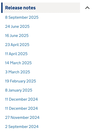
In the existing ‘Manage training for early career teachers’ API guidance, the release notes are hard to find because they’re buried within a long single navigation structure and then hidden behind a dropdown menu. The notes are listed in date order, but a lack of descriptive headings makes it difficult to scan and gauge for relevance.
What we’ve changed
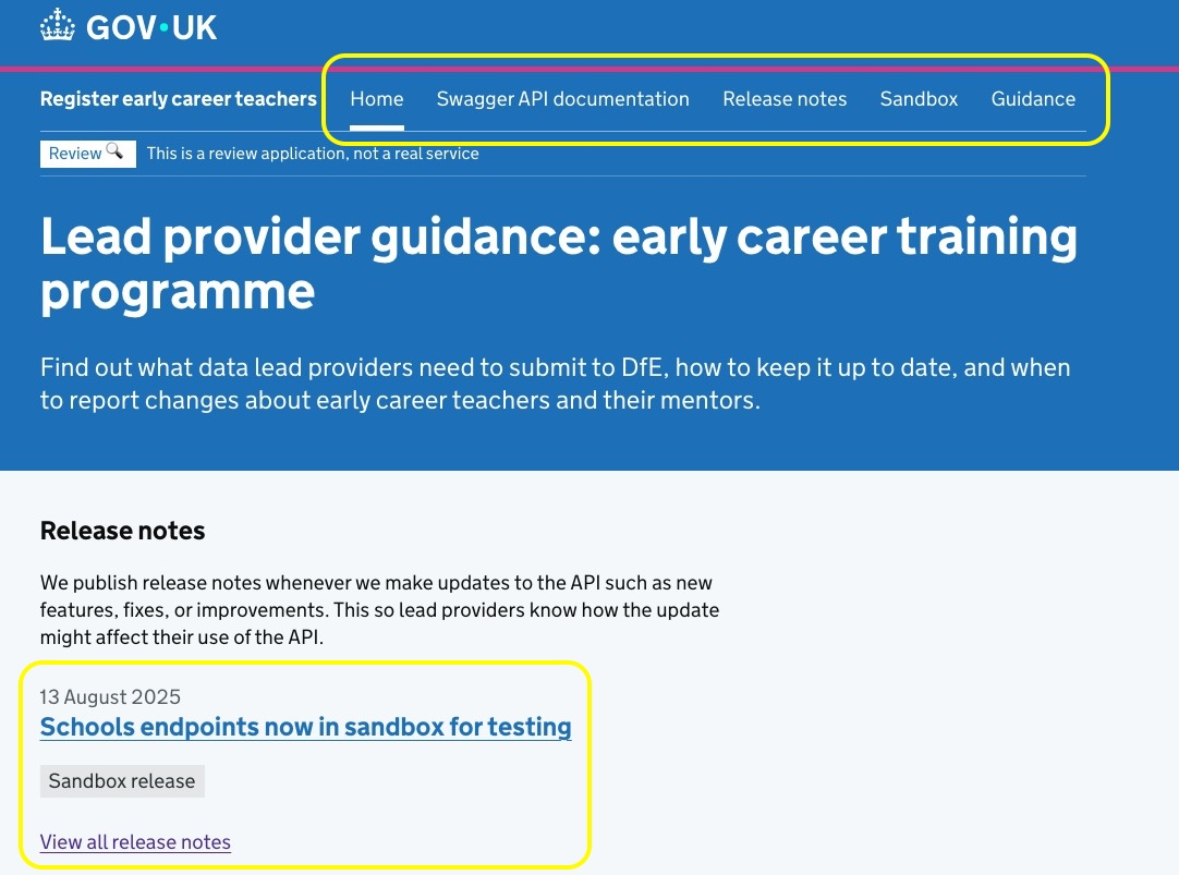
As part of our wider work into improving both general guidance and technical documentation for lead providers, we’re now testing a new way of presenting release notes in the ‘Register early career teachers’ sandbox. We’ve also made the release notes much more prominent on the landing page for lead providers.
| Area | Existing design | New design | Impact on users |
|---|---|---|---|
| Standalone page | Release notes are easy to miss as part of the single hub behemoth | We’ve created a standalone release notes page | Easy to find and navigate. Can be bookmarked for quick reference |
| Visibility | Release notes live deep within a large guidance hub | We’ve put a release notes link in the landing page’s primary navigation, and a preview section situated towards the top of the page | Users see recency cues earlier and reach notes faster |
| Headings | Date of publication | Concise, action-oriented (what changed, who it affects, what to do next) headings | Quicker to see what’s relevant |
Next steps
There’s a risk older items become harder to browse as the list grows. To mitigate this, we could add year filters or monthly anchors to provide a compact archive page.
We’ll also reach out to the support team to check if providers are still missing updates.